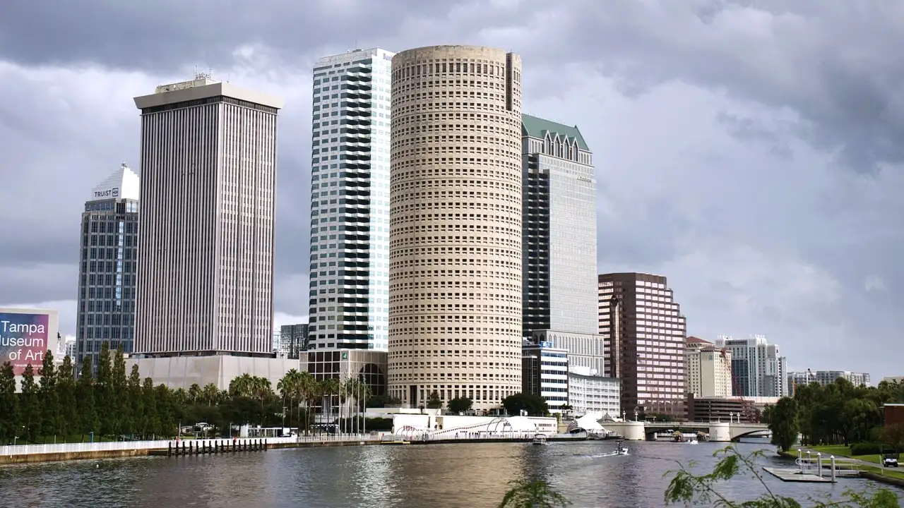
Tampa app design runs $14,000–$55,000, driven by flow count and platform coverage. B2B products with dense professional workflows sit at the upper end because the interaction design work is more involved than screen count suggests.
Why this looks different in Tampa
Tampa's app work splits along the same line as everything else in this metro. Westshore B2B products serve professional users who operate the same tool daily for years, which makes density, keyboard efficiency and reduced friction on repeated tasks far more valuable than onboarding polish. Consumer products serving the neighbourhood market are judged on first use and need the opposite.
The second Tampa-specific consideration is event-driven usage. Products serving hospitality, parking, transport and venue businesses experience concentrated load and first-time usage during convention and festival periods — thousands of people opening the app for the first time in a short window, outdoors, on a congested network. That is a design condition, not just an infrastructure one.
Tampa specifics
What actually gets in the way here
These are conditions particular to this market. If they were true everywhere, they would not be worth a page.
01
Professional daily-use tools designed for first impressions
Westshore B2B users operate the same product every day for years. Interfaces optimised for a good first run impose friction hundreds of times over, and density that would overwhelm a new user is a benefit to them.
02
Event-period first-use surges under bad conditions
Hospitality and venue products see thousands of first-time users during convention and festival windows, outdoors on congested networks. Onboarding that assumes a calm indoor session fails at exactly the moment volume peaks.
03
Navigation shaped by the feature list rather than usage
Products built by consensus give every feature equal prominence, so users navigate around the interface rather than through it — and the navigation argument restarts with every new feature.
Our approach
How we run app design in Tampa, FL
The same four stages we run everywhere, applied to this market's conditions. The sequence matters more than any individual tactic.
01
Core task and frequency analysis
We establish what the app is genuinely hired to do and how often each action occurs, then rank them. This produces the navigation hierarchy and, more usefully, an explicit list of what will deliberately be made less prominent.
02
Flows, states and information architecture
End-to-end flows for every significant task including failure and recovery paths, with the empty, loading, error and offline states specified per screen rather than deferred to development.
03
Design system and screen design
Tokens and components defined first, then screens assembled from them. Building the system before the screens means the fortieth screen is consistent by construction rather than by review.
04
Prototype, test, hand off
Interactive prototypes tested with real users on the core flows, revised, then handed to engineering with component specifications, states and behavioural notes — not a folder of static images requiring interpretation.
Local tip
If your product serves event or venue traffic, test the first-run flow outdoors on a throttled connection during a busy period. The onboarding that works in a usability lab frequently fails in the exact conditions where your volume actually arrives.
How we would measure it
Measured on task completion rate and time-on-task for the core flow, support ticket volume per screen, and first-run completion under adverse network conditions rather than ideal ones.
Proof
What we can stand behind
One documented client result, plus the market data explaining the conditions app design operates in. Each figure is labelled with what it is.
84% organic traffic increase in 3 months Documented client result
of Google queries now return an AI Overview
40%+ of Google queries now return an AI Overview HubSpot, 2026
fewer businesses shown in AI-generated local packs than classic map results
68% fewer businesses shown in AI-generated local packs than classic map results Industry research, 2026
of "near me" searchers visit a business within 24 hours
76% of "near me" searchers visit a business within 24 hours Shopify Local SEO Statistics, 2026
better conversion from fully optimised Google Business Profiles
1.8x better conversion from fully optimised Google Business Profiles Whitespark, 2026
The 84% figure is a documented result for a single client, not a projection of typical performance in this market. The figures beneath it are published market statistics from the sources named, included because they explain the environment rather than because they are our results.
Nearby markets
App Design in markets adjacent to Tampa
Adjacent markets are not interchangeable — each of these pages is written around that market's own competitive conditions.
How should a Westshore B2B product differ from a consumer app?
It should optimise for the five-hundredth session rather than the first, which inverts several defaults. Professional users in the Westshore office cluster operate the same tool daily for years, so novelty becomes a liability — anything surprising is irritating when repeated — while density, keyboard efficiency and shortcuts that would overwhelm a first-time user become genuine benefits. Small friction compounds rather than costing one conversion: an unnecessary extra click on a daily action costs hundreds of interactions annually. Consumer products are judged on first use and need generosity, guidance and clarity over density. The mistake we most often see is a B2B tool designed with consumer polish, where the onboarding is beautiful and the daily workflow requires more taps than it should, which users tolerate and quietly resent.
How do we design for Tampa event-period usage spikes?
By treating the event window as a first-use scenario under adverse conditions, because that is exactly what it is. During convention and festival periods around Channelside and the Riverwalk, hospitality, parking, transport and venue products see thousands of people opening the app for the first time in a short window — outdoors, in bright light, on a congested network, in a hurry, frequently while walking. An onboarding flow that assumes a calm indoor session with good connectivity will fail precisely when volume peaks. The design requirements are concrete: reach a useful outcome without account creation where possible, degrade gracefully on a poor connection with explicit offline and retry states, size touch targets for a moving thumb, and ensure contrast survives direct sunlight.
Why does task frequency mapping settle navigation arguments?
Because it replaces opinion with a usage-shaped ordering that everybody can check. Navigation debates are otherwise unwinnable — every stakeholder believes their feature is important, and importance is not measurable in a way that produces agreement. Frequency is. The cost of a navigation decision multiplies by how often it is encountered, so an action performed daily should be immediate and one performed monthly merely reachable, regardless of how strategically significant either feels. Mapping actual frequency also produces the harder half of the exercise: an explicit list of what is deliberately demoted, because a hierarchy where nothing is made less prominent is not a hierarchy. Once this exists, every future placement decision has an objective test rather than restarting the argument with each new feature.
What do you hand our engineering team, and when should they be involved?
A component library with tokens for type, spacing, colour and elevation, every component specified across all its states — including the loading, empty, error and offline states that real usage finds immediately — flow diagrams covering failure and recovery paths, behavioural notes on transitions and optimistic updates, and an interactive prototype of the core flows. What we do not hand over is a folder of static screens, because that forces engineers to infer the system from examples and guarantees inconsistency by the fortieth screen. Engineering should be involved from the flow-mapping stage rather than at handoff, because we need to know what is expensive to build and what data is genuinely available at each point. Designs that ignore those constraints get rebuilt during implementation by whoever is closest to the deadline.
Coverage area
Serving Tampa, FL and Surrounding Neighborhoods
Our team works from St. Petersburg, FL, and covers
Tampa, FL alongside the surrounding communities below.
Neighborhoods and communities we cover
Downtown Tampa
Hyde Park
Westshore
Ybor City
Channelside
SoHo
Zip codes served
33602
33606
33607
33609
33611
33629
Get clear on the one job your product is hired to do in Tampa, FL
Walk us through your product and we will map the task frequency and the flows worth testing first. It usually surfaces at least one navigation assumption that has been quietly costing you retention.